Revisiting Gantt Charts
Table of Contents
Sitemap
|
|


Context
While I was in Porto Alegre, I finally took the time to give a try to an idea we had with Lucas Schnorr for revisiting Gantt charts. Something that is annoying with such representations is that when there are too much information to display, most tools (like vite) do it badly and rely on external aggregation tools like anti-aliasing or openGL that produce visualization artifacts, which may be quite misleading. Let me try to briefly summarize what Lucas gathered on how these tool work:
- profilers (s.a
ipm,scalasca) aggregate the whole trace in time so they're not really Gantt Charts and are very crude. They do not allow to explore temporal evolution. jumpshot: makes chunks (hierarchy of chunks are defined in the slog trace when tracing the application).jumpshotdisplays aggregated chunks (time intervals) and explodes these chunks when enough space is available. The representation of an aggregated chunk is a set of stacked horizontal bars whose area is proportional to the total amount of time spent in a given state. We use a similar idea but chunks are not fixed in the trace, which allows a much finer view.vitedraws everything and relies on openGL for anti-aliasing. The consequence is that although it is quite fast, the anti-aliasing creates many visualization artifacts and the image is very unstable when scrolling and zooming. Events appear and disappear all the time with no real reason when looking at the whole trace.paraver: divides pixel space into a set of blocks and computes which events fall in the blocks. Then a single color is assigned to the blocks with various customizable methods for picking the color: mode (color of the most frequent state), max (color of the longest state), average (I don't know what this means), first event, last event, random selection. The same methodology is applied for both space and time at once. Surprisingly the image is quite unstable when scrolling horizontally the view. This comes from a sequential with no look-ahead aggregation. This ensures indeed that no aggregate state will have a width smaller than a pixel but the aggregation depends on the starting point. Here I try a slightly different idea (not a revolutionary one, far from that), which does not have this drawback although it may lead to draw aggregated events that are less wide than a pixel. But somehow, when you have a very tiny event surrounded by two very large events, it may be quite important to see that there was an interruption…Vampir: although we could not try it as it is a commercial product, when discussing with developers, we were told that it displays the modeprojections: we could not find any aggregation in the code so everything is plotted and it has the same issues as vitepaje: Paje has an interesting approach. Depending on timescale, if checked whether events are smaller than a pixel (and could thus not be safely drawn) and will aggregate them into an aggregate state depicted by a slashed box. This slashed box horizontally stacks rectangles whose width is proportionnal to the frequency of each state. Paje has somehow the same scrolling issue as paraver although it is merely appears because of all the caching mechanisms ofpajethat rely on chunks. It is one of the rare tool that has a very explicit aggregation.- Fisheye views: some tools (although we do not know any free ones) use fisheye views that distort time. This has to be used with a lot of care but allows to zoom on some parts while still having the big picture at hand.
Redeveloping a new visualization tool can be cumbersome for
non-specialists like me so I coined some time ago the idea of
prototyping new visualization using R and tools such as ggplot. I was
just missing time and the cumsum function (you do not want write for
loops in R, it's so slooooow) that I recently stumbled upon and which
enables to efficiently integrate staircase functions. What we try is
extremely similar to what Paje does.
R setup
Let's define a simple function that reads a paje trace converted with
pj_dump into a csv file. There are a few minor cleanups.
options( width = 200 )
library(plyr)
library(ggplot2)
read_paje_trace <- function(file) {
  df <- read.csv(file, header=FALSE, strip.white=TRUE)
  names(df) <- c("Nature","ResourceId","Type","Start","End","Duration", "Depth", "Value")
  df = df[!(names(df) %in% c("Nature","Type", "Depth"))]
  df$Origin=file
  df <- df[!(df$Value %in% c("Initializing","Nothing","Sleeping","execute_on_all_wrapper","Blocked")),]
  m <- min(df$Start)
  df$Start <- df$Start - m
  df$End <- df$Start+df$Duration
  df
}
Read trace and clean it up
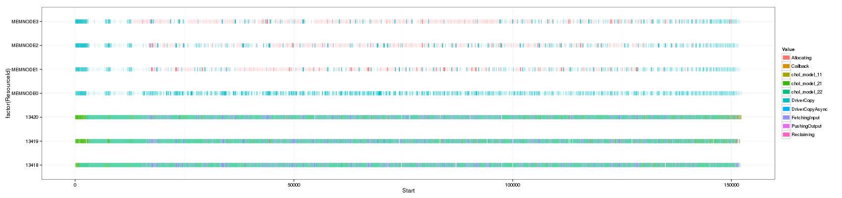
Let's load a trace I recently obtained from the execution of Cholesky using StarPU. I also remove all events happening before time 42000 because they are not significant in this trace (mainly some initialization).
df_native <- read_paje_trace('~/Work/SimGrid/infra-songs/WP4/R/starPU/paul/paje.irl.70.csv')

df_native <- df_native[df_native$End>42000,]
m <- min(df_native$Start)
df_native$Start <- df_native$Start - m
df_native$End <- df_native$Start+df_native$Duration
df_native <- df_native[with(df_native, order(Start,ResourceId,Value)),]
Gantt Chart
Using Segments
ggplot(df_native,aes(x=Start,xend=End, y=factor(ResourceId),
                     yend=factor(ResourceId), color=Value))+theme_bw()+
  geom_segment(size=4)
Using rectangles
ggplot(df_native,aes(xmin=Start,xmax=End, ymin=as.numeric(ResourceId), ymax=as.numeric(ResourceId)+1,fill=Value))+
    theme_bw()+geom_rect() + scale_y_continuous(limits=c(min(as.numeric(df_native$ResourceId)),max(as.numeric(df_native$ResourceId))+1))
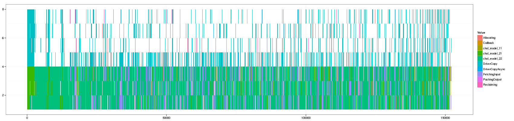
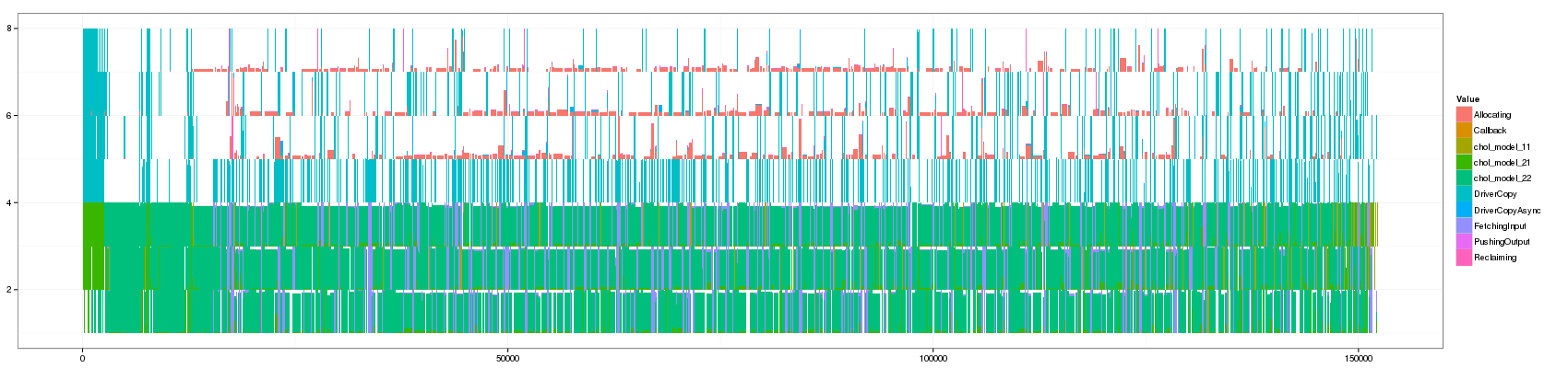
As you can see, the two representations are very different. Some events do not show up in the rectangle Gantt chart while they can be seen on the segment one. This is mainly due to anti-aliasing effects. Anyway, there so many events that quantifying the frequency of events is difficult and such representation is difficult to exploit.
Toward a better Gantt Chart ?
We would like an evolution of the previous representation that does not depend on anti-aliasing aggregation capabilities, which means aggregation needs to be explicit. We do not want to distort time (e.g., using fisheye views that enable to zoom on parts where many information need to be displayed) as this can be an important information. When event last for a long enough duration (i.e. at least larger than a pixel of width), they should be displayed as such and are somehow "pure" original events. When there are too many of them, they should be aggregated and represented with an "alternative" representation. What we propose is simply to display the frequency of these events (hence the coloured area still represents the total amount of time spent in a given state). To ensure these aggregated events are not mixed with others, we display them horizontally and stack them so that idle time (,which is also a state) can also be easily identified.
Extracting pure events
compute_chunk <- function(Start,End,Duration,min_time_pure) {
  chunk <- rep(0,length(Duration))
  v <- Duration>min_time_pure
  v2 <- c(FALSE,Start[-1]>End[0:(length(v)-1)]+min_time_pure)
  chunk[v | c(FALSE,v[0:(length(v)-1)]) | v2] <-1
  cumsum(chunk)
}
df_native <- ddply(df_native, c("ResourceId"), transform, Chunk = compute_chunk(Start,End,Duration,100))
df_native2 <- ddply(df_native, c("ResourceId","Chunk"), transform, Start=min(Start), End=max(End))
Note that I did not initially intend to use cumsum for grouping
events together but this is exactly what is needed here. Now let's
create the aggregate representation.
df_aggregate <- ddply(df_native2,c("ResourceId","Chunk","Value"),summarize,
    Duration = sum(Duration), Start=min(Start), End=max(End))
df_aggregate <- ddply(df_aggregate, c("ResourceId","Chunk"), transform, Activity = Duration/(End-Start))
Hand made stacked plotting
posY is used to compute the Y coordinates for rectangles. This usage
of cumsum may look like black magic at first but is actually exactly
what we want.
df_aggregate <- ddply(df_aggregate, c("ResourceId","Chunk"), transform, PosY=as.numeric(ResourceId)+cumsum(Activity))
And voilà!
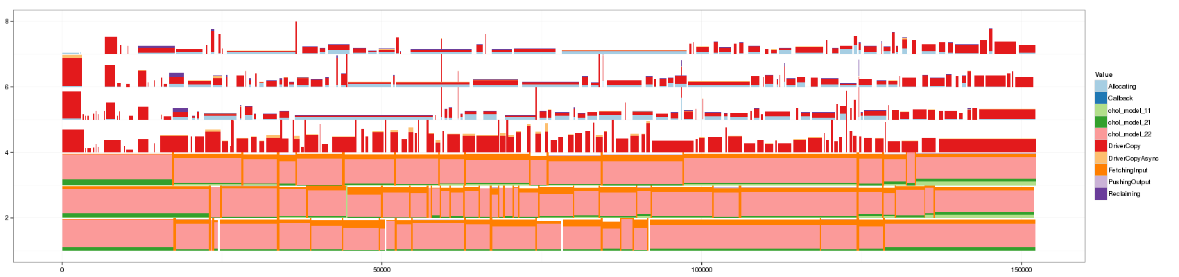
ggplot(df_aggregate,aes(xmin=Start,xmax=End, ymin=PosY-Activity, ymax=PosY,fill=Value))+
    theme_bw()+geom_rect() + scale_y_continuous(limits=c(min(as.numeric(df_aggregate$ResourceId)),max(as.numeric(df_aggregate$ResourceId))+1))
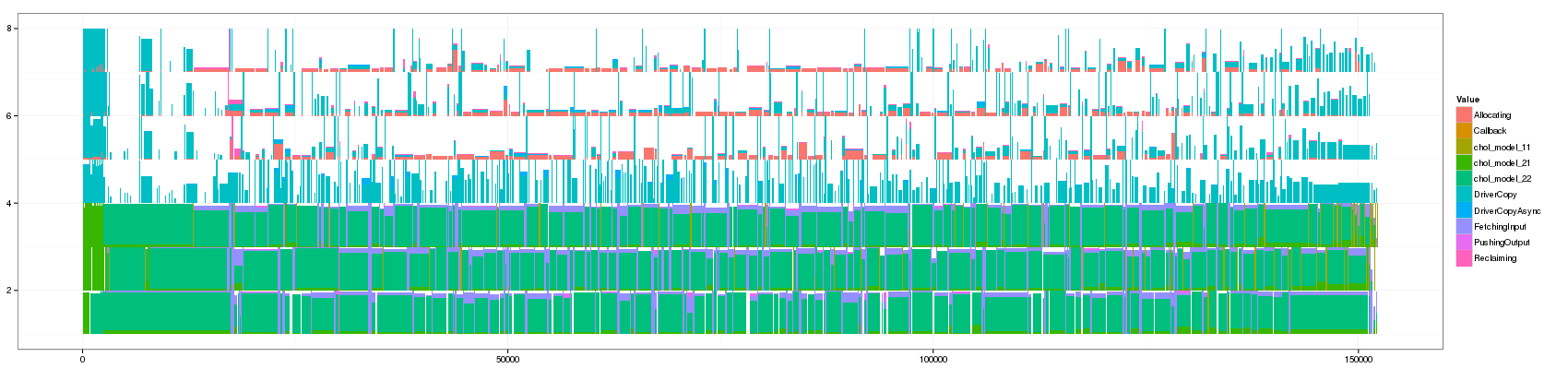
This is actually the same representation as paje except that aggregated states are slashed and rectangles are vertically stacked instead of horizontally. This is a minor difference with a few advantages.
One has to learn to read such representation but the main advantages are that one controls perfectly aggregation and that although some information was lost, it is now much much more readable than the classical Gantt chart. An improvement compared to Paje representation (as we now stack vertically and not horizontally) is that it is easier to estimate idle time (and much easier compared to classical Gantt Charts). Distinguishing "pure" states from "aggregated" ones remains difficult but I'm sure this could be improved by adding borders (one would lose space though so it should be tried).
Many points are obviously not addressed at all here. The way I grouped events is quite arbitrary and rough and one could imagine many smarter ways to do this. My next move is to try to visually evaluate how the grouping factor affect the visualization.
Impact of the minimum duration threshold
Let's reformat the previous code in a "cleaner way".
R setup
As earlier, let's set things up.
options( width = 200 )
library(plyr)
library(ggplot2)
read_paje_trace <- function(file) {
  df <- read.csv(file, header=FALSE, strip.white=TRUE)
  names(df) <- c("Nature","ResourceId","Type","Start","End","Duration", "Depth", "Value")
  df = df[!(names(df) %in% c("Nature","Type", "Depth"))]
  df$Origin=file
  df <- df[!(df$Value %in% c("Initializing","Nothing","Sleeping","execute_on_all_wrapper","Blocked")),]
  m <- min(df$Start)
  df$Start <- df$Start - m
  df$End <- df$Start+df$Duration
  df
}
df_native <- read_paje_trace('~/Work/SimGrid/infra-songs/WP4/R/starPU/paul/paje.irl.70.csv')

df_native <- df_native[df_native$End>42000,]
m <- min(df_native$Start)
df_native$Start <- df_native$Start - m
df_native$End <- df_native$Start+df_native$Duration
df_native <- df_native[with(df_native, order(Start,ResourceId,Value)),]
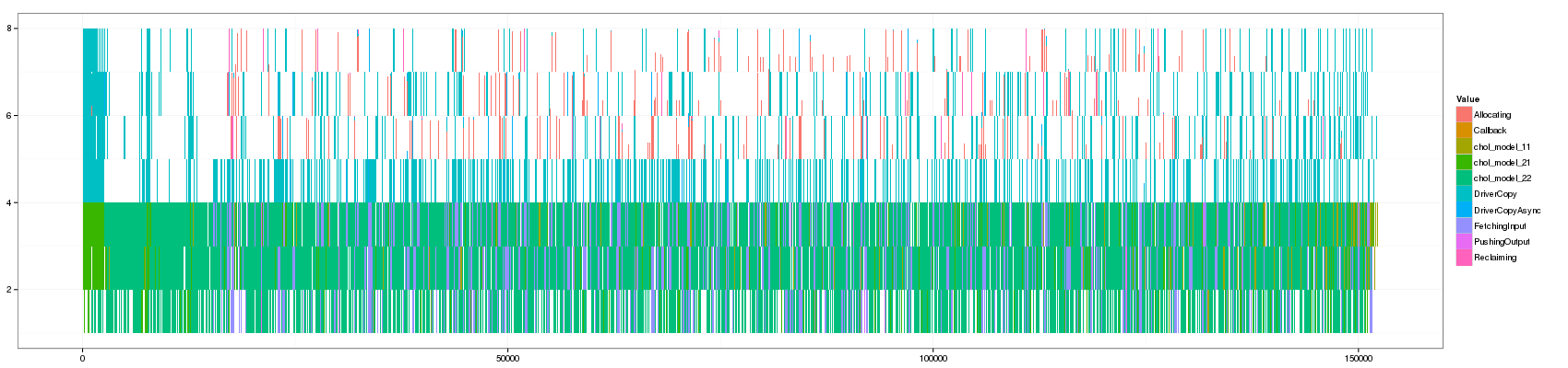
Aggregating for different thresholds
compute_chunk <- function(Start,End,Duration,min_time_pure) {
  chunk <- rep(0,length(Duration))
  v <- Duration>min_time_pure
  v2 <- c(FALSE,Start[-1]>End[0:(length(v)-1)]+min_time_pure)
  chunk[v | c(FALSE,v[0:(length(v)-1)]) | v2] <-1
  cumsum(chunk)
}

aggregate_trace <- function(df_native,min_time_pure) {
  # The here function is a trick to cope with weird scoping in R and allow
  # plyr to mix column names and variable names when calling the compute_chunk function
  df_native <- ddply(df_native, c("ResourceId"), here(transform), Chunk = compute_chunk(Start,End,Duration,min_time_pure))
  df_native2 <- ddply(df_native, c("ResourceId","Chunk"), transform, Start=head(Start,1), End=tail(End,1))
  # you may wonder why this length(Origin)... if you use length(Duration), the new Duration column
  # will be used instead of the old one, hence always a value of 1... :(
  df_aggregate <- ddply(df_native2,c("ResourceId","Chunk","Value"),summarize,
      Duration = sum(Duration), Start=head(Start,1), End=head(End,1), Number=length(Origin))

  df_aggregate <- ddply(df_aggregate, c("ResourceId","Chunk"), transform, Activity = Duration/(End-Start))
  df_aggregate <- ddply(df_aggregate, c("ResourceId","Chunk"), transform, PosY=as.numeric(ResourceId)+cumsum(Activity))
  df_aggregate
}
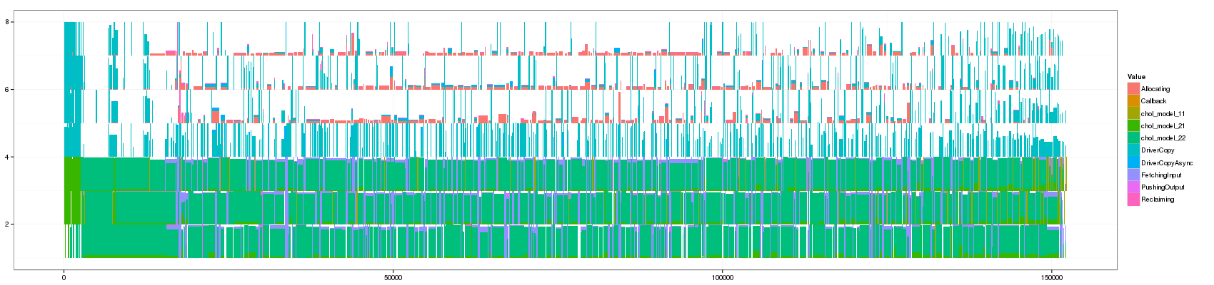
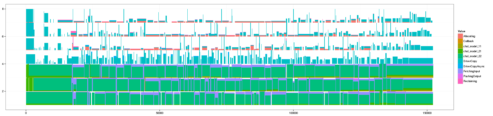
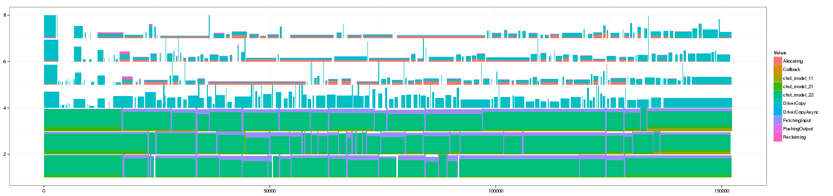
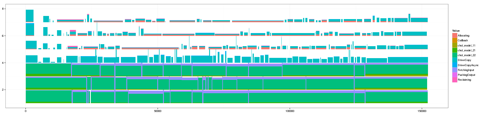
Let's generate a bunch of values and look at how this affects the visualization
for(min_duration in c(1,10,50,100,150,200,250,300,350,400,450,500,1000)) {
  filename <- paste("GC_",min_duration,".png",sep="")
  print(paste("+ ", min_duration, ": ", "[[./",filename,"]]",sep=""))
  png(filename, width=1700, height=400)
  df_aggregate <- aggregate_trace(df_native,min_duration)
  p <- ggplot(df_aggregate,aes(xmin=Start,xmax=End, ymin=PosY-Activity, ymax=PosY,fill=Value))+
        theme_bw()+geom_rect() + scale_y_continuous(limits=c(min(as.numeric(df_aggregate$ResourceId)),max(as.numeric(df_aggregate$ResourceId))+1))
  print(p)
  dev.off()
}
- 1:
- 10:

- 50:
- 100:

- 150:
- 200:
- 250:
- 300:

- 350:
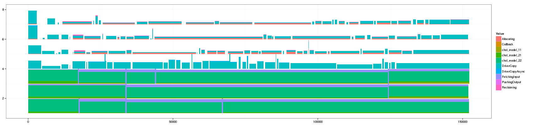
- 400:
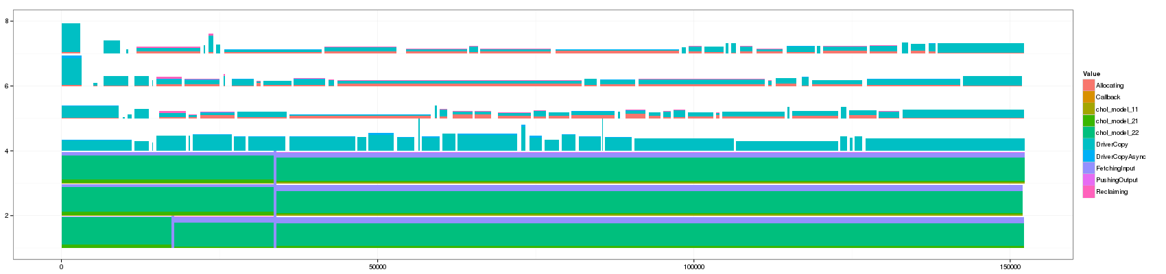
- 450:

- 500:
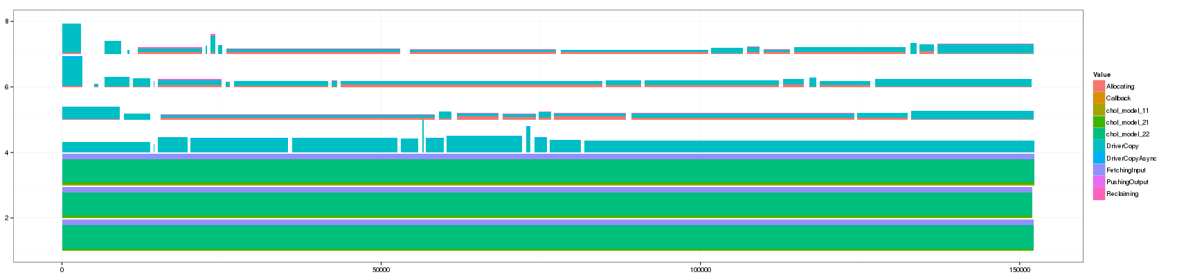
- 1000:
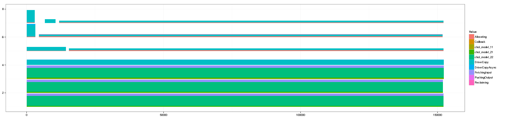
Note that it took the whole night to generate the view for a threshold
of 1 on my laptop !!! (shame on me for wasting so much Watts on this
stupid picture) The ddply approach is really not suited anymore to
such fine-grain workload.
convert GC_10.png GC_50.png GC_100.png GC_150.png GC_200.png GC_250.png GC_300.png GC_350.png GC_400.png GC_450.png GC_500.png GC_1000.png GC_animated.gif
Something that is really cool and that Lucas noticed is that such animation allows to seamlessly detect some events that last significantly longer than others as they are not aggregated.
The previous visualization has a several minor issues to fix though:
- distinguishing between pure and aggregated events is not that easy. I propose to change the intensity of the color for this.
- The color scale used here is the default one and is not suited to such categorical events. Colors should be more far away from each others in the color wheel.
- Some aggregated objects are very large and lose a lot of information. It may be interesting to bound the width of such aggregated objects.
Playing with colors
df_aggregate <- aggregate_trace(df_native,200)
Let's start by changing the color set.
ggplot(df_aggregate,aes(xmin=Start,xmax=End, ymin=PosY-Activity, ymax=PosY,fill=Value))+
        theme_bw()+geom_rect() +
        scale_y_continuous(limits=c(min(as.numeric(df_aggregate$ResourceId)),max(as.numeric(df_aggregate$ResourceId))+1)) +
        scale_fill_brewer(palette="Paired")
And now, let's play with brightness.
ggplot(df_aggregate,aes(xmin=Start,xmax=End, ymin=PosY-Activity, ymax=PosY,fill=Value))+
        theme_bw()+geom_rect(aes(alpha=-log10(Number))) +
        scale_y_continuous(limits=c(min(as.numeric(df_aggregate$ResourceId)),max(as.numeric(df_aggregate$ResourceId))+1)) +
        scale_fill_brewer(palette="Paired")

I think we have a winner. Let's keep this visualization in mind:
visualize <- function(df_aggregate, palette="Paired") {
  ggplot(df_aggregate,aes(xmin=Start,xmax=End, ymin=PosY-Activity, ymax=PosY,fill=Value))+
         theme_bw()+geom_rect(aes(alpha=-log10(Number))) +
         scale_y_continuous(limits=c(min(as.numeric(df_aggregate$ResourceId)),max(as.numeric(df_aggregate$ResourceId))+1)) +
         scale_fill_brewer(palette=palette)
}
Playing with aggregation within aggregated objects
Since I plan to now group events in a different way, I need to rewrite the aggregation functions.
compute_chunk <- function(Start,End,Duration,min_time_pure) {
  chunk <- rep(0,length(Duration))
  v <- Duration>min_time_pure
  v2 <- c(FALSE,Start[-1]>End[0:(length(v)-1)]+min_time_pure)
  chunk[v | c(FALSE,v[0:(length(v)-1)]) | v2] <-1
  cumsum(chunk)
}

aggregate_trace <- function(df_native,min_time_pure,max_time_agreg) {
  # The here function is a trick to cope with weird scoping in R and allow
  # plyr to mix column names and variable names when calling the compute_chunk function
  df_native <- ddply(df_native, c("ResourceId"), here(transform), Chunk = compute_chunk(Start,End,Duration,min_time_pure))
  df_native <- ddply(df_native, c("ResourceId","Chunk"), transform, StartChunk=head(Start,1), EndChunk=tail(End,1))
  df_native <- ddply(df_native, c("ResourceId","Chunk"), here(transform), SubChunk=floor((Start-StartChunk)/max_time_agreg))
  df_native <- ddply(df_native, c("ResourceId","Chunk","SubChunk"),transform, StartChunk=min(Start), EndChunk=max(End))
  # you may wonder why this length(Origin)... if you use length(Duration), the new Duration column
  # will be used instead of the old one, hence always a value of 1...
  df_aggregate <- ddply(df_native,c("ResourceId","Chunk","SubChunk","Value"),summarize,
      Duration = sum(Duration), Start=head(StartChunk,1), End=tail(EndChunk,1), Number=length(Origin))

  df_aggregate <- ddply(df_aggregate, c("ResourceId","Chunk","SubChunk"), transform, Activity = Duration/(End-Start))
  df_aggregate <- ddply(df_aggregate, c("ResourceId","Chunk","SubChunk"), transform, PosY=as.numeric(ResourceId)+cumsum(Activity))
  df_aggregate
}
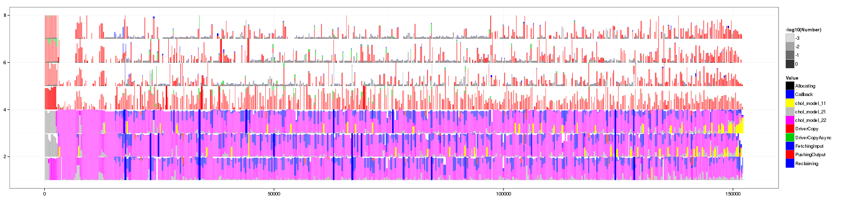
df_aggregate <- aggregate_trace(df_native,300,300)
And voilà!
visualize(df_aggregate)
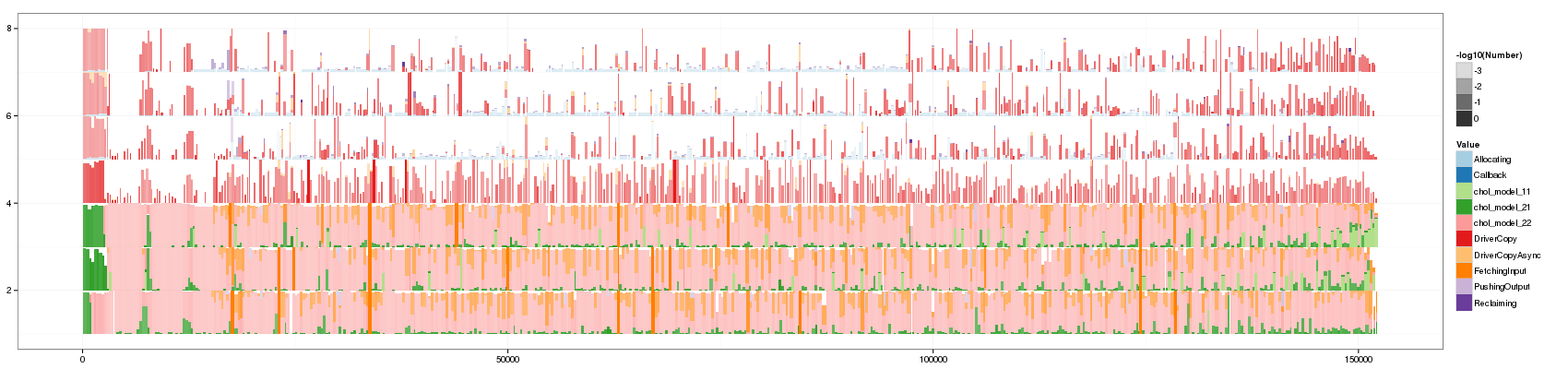
This visualization is now richer than Paje's view as it shows more details about what happens in aggregated states.
I think this is an interesting view:
- Abnormally long events pop out thanks to their height and color intensity.
- It is more "scrolling resilient" than classical Gantt Charts.
- Areas have real meaning and measuring time spent in each state as well as the variability with our eyes seems possible to me.
- Very small events surrounded by "pure" events are probably given slightly too much emphasis but they may be important as well since they show a rupture.
- There is a lot of information and I'm not really satisfied with this usage of intensity that mixes colors meaning. A possibility would be to sort states by frequency so as to ensure that most frequent states have very different colors…
Final test with colors
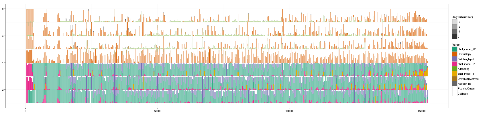
Remember, the previous color map was this one. Let's try others to see if we can solve the color mixing issue.
df_profile <- ddply(df_aggregate, c("Value"), summarize, Duration = sum(Duration))
# df_profile
new_value_order <- df_profile[with(df_profile, order(-Duration)),]$Value
# as.numeric(df_profile$Value)
df_profile$Value <- factor(df_profile$Value, levels=new_value_order)
# as.numeric(df_profile$Value)
df_profile[with(df_profile, order(-Duration)),]
df_aggregate2 <- df_aggregate
df_aggregate2$Value <- factor(df_aggregate2$Value, levels=new_value_order)
	       Value    Duration
  5    chol_model_22 323637.0119
  6       DriverCopy 118429.2368
  8    FetchingInput  74418.9603
  4    chol_model_21  27640.9531
  1       Allocating  23230.7838
  3    chol_model_11   8523.5770
  7  DriverCopyAsync   4805.4038
  10      Reclaiming   4565.5289
  9    PushingOutput   2479.6719
  2         Callback     19.6422
visualize(df_aggregate2,palette="Dark2")
Last palette try with a palette generated from http://colorbrewer2.org/:
  ggplot(df_aggregate,aes(xmin=Start,xmax=End, ymin=PosY-Activity, ymax=PosY,fill=Value))+
         theme_bw()+geom_rect(aes(alpha=-log10(Number))) +
         scale_y_continuous(limits=c(min(as.numeric(df_aggregate$ResourceId)),max(as.numeric(df_aggregate$ResourceId))+1)) +
         scale_fill_manual(values = c("0xFB9A99", "0xE31A1C",
                                      "0xFDBF6F", "0xFF7F00", "0xCAB2D6",
                                      "0x6A3D9A", "0xA6CEE3", "0x1F78B4", "0xB2DF8A",
                                      "0x33A02C"))
Mmmh… No. It's not really better. I think there is simply too much information. So we really should play with Robin and Jean-Marc's entropia idea.
Entered on